Opal Wedding in Autumn: How the Shimmering Wedding Trend Works with Warm Colours
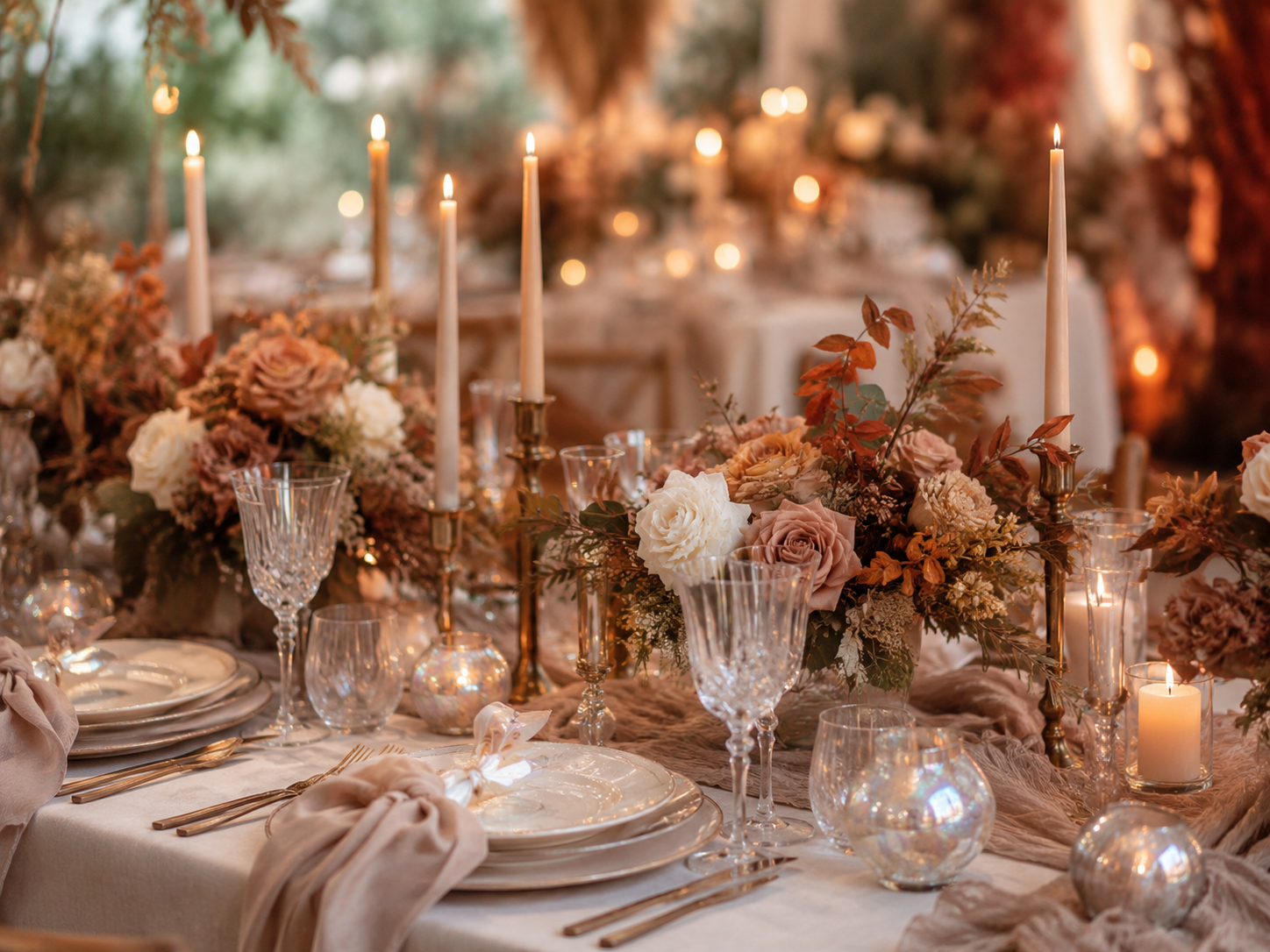
Shimmering surfaces, subtle reflections and an almost pearlescent glow can seem rather cool at first glance. For an autumn wedding, however, the opal look does not have to feel futuristic or frosty. Combined with warm natural tones, soft fabrics and plenty of candlelight, it creates a wedding aesthetic that feels elegant and inviting at the same time.
For me, that is exactly the appeal of an Opal Wedding in Autumn: the shimmer is not the actual colour concept. It is an additional layer that makes cream, champagne, taupe, smoky grey and warm rose feel more alive. The effect changes again and again depending on how the light falls.
What does an Opal Wedding actually mean?
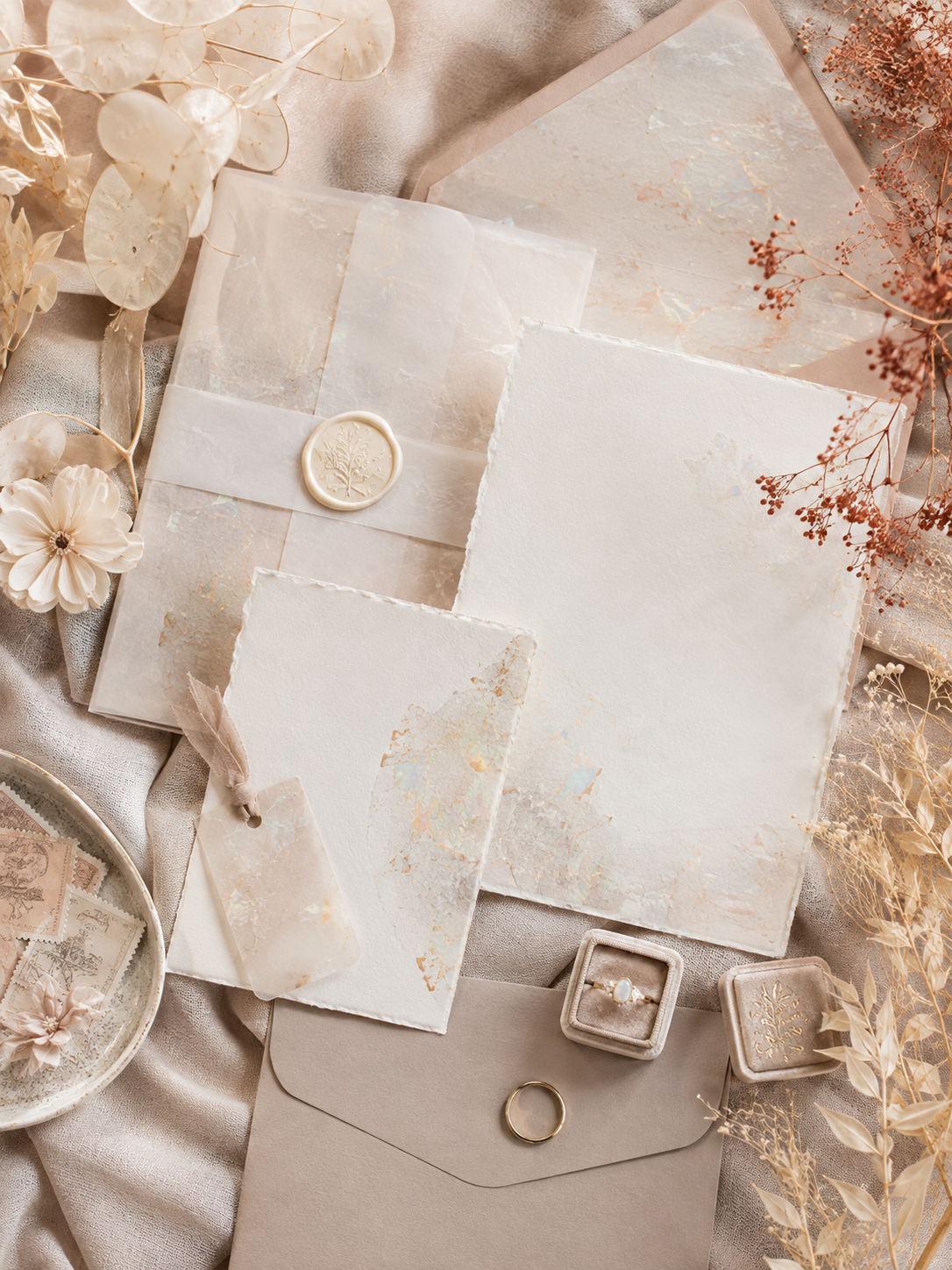
The look is inspired by the special appearance of opal and mother-of-pearl. Instead of one clear colour, delicate reflections emerge depending on the surface and the light. White can suddenly appear rosy, champagne-toned or slightly bluish. Glass, mother-of-pearl, iridescent finishes, organza and semi-transparent papers enhance this effect.
The key is moderation. A complete decoration made from holographic materials can quickly feel more like a party or festival theme. At a wedding, opal works much better as an accent: a shimmering plate, a subtle stationery finish, individual glass objects or a cake with a delicate pearlescent effect are often enough.
Why the look works especially well in autumn
Autumn weddings thrive on depth. The light becomes softer, evenings start earlier and materials such as velvet, linen, wood or textured papers look especially beautiful. These matte, warm surfaces create a strong contrast with the opal shimmer.
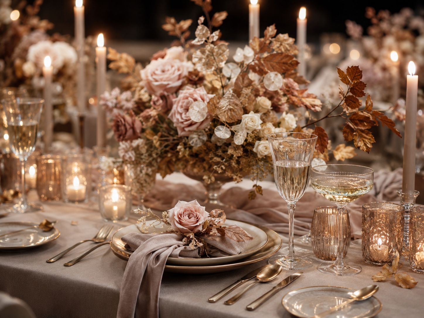
Instead of orange and classic rust red, the colour palette can remain much calmer. I especially like cream, champagne, taupe, warm rose and smoky grey. If you want more depth, you can add small accents of terracotta, plum or muted moss green. This keeps the wedding autumnal without needing pumpkins or typical seasonal motifs.
In the evening, candlelight becomes an important part of the design. It catches glass, cutlery, shimmering ceramics and stationery and creates reflections that are barely visible during the day. The decoration changes with the light without requiring additional elements.
The right colour palette: warm rather than holographic
For opal to feel sophisticated in autumn, I would deliberately keep the base calm. Two or three main colours are enough. Cream or off-white creates the foundation, while taupe or champagne adds warmth. A muted rose can be added as a soft accent colour.
The opal effect itself should not be treated as another colour. It works more like metal at a classic wedding: as a linking detail that appears in different places. This makes the concept feel considered rather than overloaded.
Iridescent stationery without a glitter look
Stationery is a particularly subtle way to use the trend. Transparent or semi-transparent inserts, pearlescent effects, textured paper and delicate foil details give invitations, menu cards or name cards a special surface. The effect can be something you only notice at second glance.
If you combine different stationery elements, not every piece needs to shimmer. A menu card on matte natural paper next to an iridescent name card is usually more interesting than five identical glossy surfaces. Wax seals, silk ribbon or vellum can also connect the different textures.
Table styling: let the light do the work
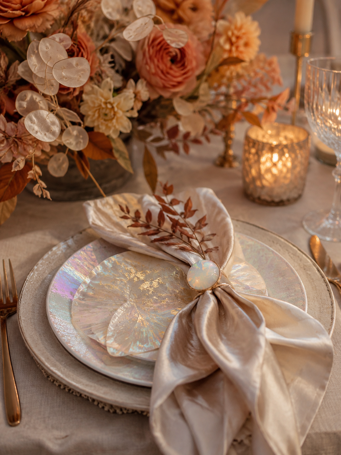
Iridescent charger plates, hand-blown glass, mother-of-pearl napkin rings or individual shimmering vases work well for table styling. Pair them with linen napkins, matte ceramics and plenty of candles. This mix keeps the table from feeling too smooth or too cool.
For the flowers, I would not try to recreate the opal effect literally. Natural arrangements in cream, dusty pink, mauve and muted brown tones work better. Autumn branches, grasses and textured foliage add movement. This keeps the styling seasonal even if the main colour palette is very light.
Fabrics and textures make the difference
An opal concept works especially well when you plan not only colours, but surfaces too. Organza catches light differently from velvet. Linen is more matte than satin. Glass reflects more strongly than ceramics. These contrasts give a monochrome colour palette depth.
A silky table runner over a matte tablecloth, transparent napkin ribbons or a light fabric backdrop may already be enough. You do not need shimmer everywhere. The most beautiful concepts often emerge where glossy and matte materials are deliberately placed next to one another.
The wedding cake can carry the look too
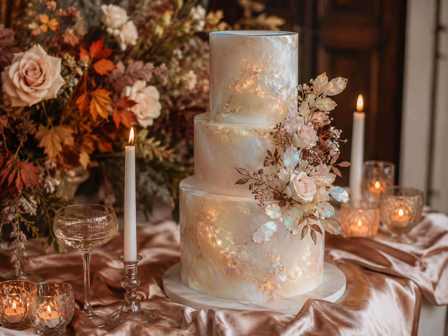
A cake with a pearlescent surface is a beautiful way to complete the concept. Instead of strong glitter, fine, irregular areas of shimmer suit the natural autumn aesthetic better. Cream-coloured flowers, individual warm-toned leaves or transparent sugar flowers can echo the theme.
The same rule applies here: the effect is stronger when the surroundings remain calm. On a table with warm fabric, a few flowers and candles, the surface has enough space to stand out without making the sweet table feel like a themed set.
5 easy ways to use the opal trend
- Stationery: Use a pearlescent effect only on selected cards or details.
- Table: Combine shimmering plates or glasses with matte linen and ceramics.
- Light: Use plenty of candles at different heights instead of cool effect lighting.
- Textures: Mix organza, satin or glass with wood, natural paper and velvet.
- Colour palette: Keep the base warm and calm; the shimmer is the accent, not the main colour.
What I would avoid with an Opal Wedding
Too many rainbow surfaces quickly take away the elegance of the look. The same applies to cool white light, lots of silver and large amounts of glitter. If every element is demanding attention, reduce it. The opal effect works best when it is discovered rather than overpowering everything else.
You also do not need an overly rigid colour scheme. Opal is all about changing nuances. Champagne can sit next to taupe, rose next to cream and smoked glass next to clear glass. What matters is that the colour temperatures harmonise with one another.
Conclusion: autumnal without looking like classic autumn decoration
An Opal Wedding is an interesting alternative for couples who want a light, elegant wedding without losing the warmth of autumn. The trend is not about using as much shimmer as possible, but about the contrast between reflections, natural materials and a warm, restrained colour palette.
If you are currently planning your colour palette, save the combinations that genuinely suit you instead of trying to use every trend at once. I also collect more colour ideas and wedding inspiration on Pinterest.
Transparency notice: This article was created with the support of AI. The text and, where applicable, individual images were editorially reviewed and edited.
Leave a Reply